Grey Goose Cherry Noir
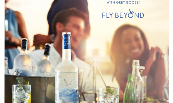
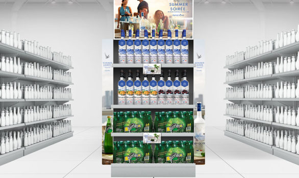
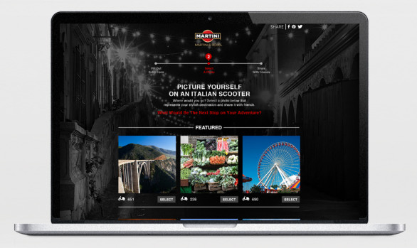
Branding / Digital / Packaging / Point of SaleGrey Goose is a premium spirit known for it’s light iconic blue topped bottle and aspirational voice. With Grey Goose Cherry Noir they were looking to target a more urban voice, to evolve the brand through the vehicle of flavor to speak in a different voice. As the “dark” flavor, the brand story was created to have a film noir component of mystery and allure. Packaging featured a dark impressionistic cherry painting and the name Cherry Noir was chosen as the best representation of the complex flavor of the liquid. Visuals were stark and featured mostly product shrouded in shadows and were carried out in Print, OOH and on and off premise environments. Bottle drops, trade kits and other press worthy pieces worked in conjunction with a big digital execution called “hotel noir” executed by a partner agency, that played off the brand story.
Client: Grey Goose/Bacardi USA
–
Creative Director: Hilary Clements
Creative Director-Writing: Rachel McInnis
Art Director: Elyse Brisko
Related Projects