White-Rodgers Mobile App
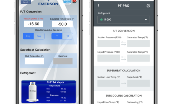
Digital / UX/UIThe Challenge: How might we create a better user experience in the process of fixing aesthetic design changes without a lot of extra lifting?
UX Asks:
• Create visual uplift with new brand styles
• Make adjustments for ADA and mobile best practices
• Improve user flow and navigation through incremental changes
• Fix misleading design elements
• Create an organized system behind the library so client can change products/make revisions
The Results: By combining a wires/visual design phase enough efficiency was gained to address both phases in one.The final application launched with aesthetic, organization and functionality changes in place. *Application launched in 3.2022 so data is not available.
View the Heuristic Review/Work Audit –
View Dev Walkthrough –

